| beforeafter1.psd | |
| File Size: | 805 kb |
| File Type: | psd |
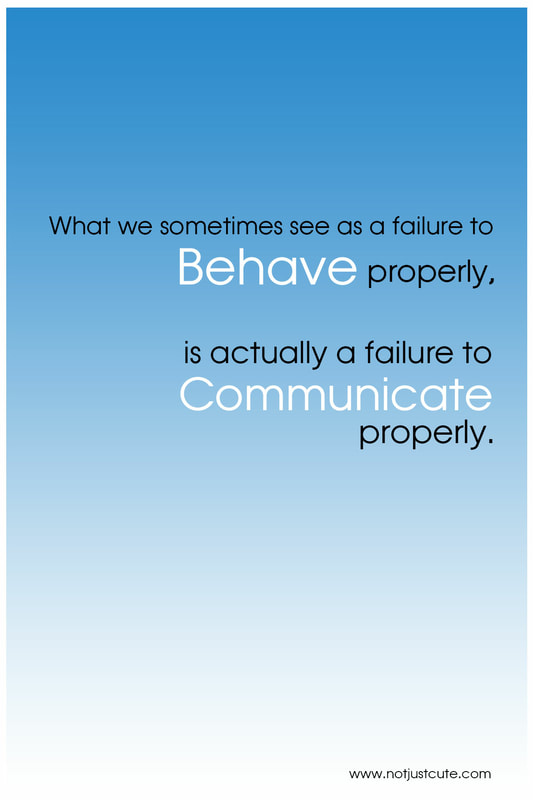
The white space in the first graphic in ineffectual. In contrast, the second image makes use of its white space with subtle gradient coloring. The change in case and the multiple font colors detract from the overall message in the first image. The second image maintains a consistent font style. The contrasting light and dark font as well as the change in font size achieves the emphasis on "behave" and "communicate" without distracting the viewer. In addition, the second image maintains consistent spacing and a right alignment which is more visually appealing than the first image's misalignment and haphazard spacing. A simple message needs only a simple design.
| beforeafter2.psd | |
| File Size: | 10297 kb |
| File Type: | psd |
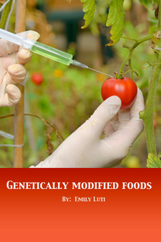
The first graphic attempts to highlight its main photo with a border, but the attempt fails to add interest to the design. The title is not positioned well and does not seem to have proper alignment. The font color is a poor choice, though proper positioning would have improved the design. The poor positioning limits the impact of the photo, the design's feature image. The second image follows the rule of thirds in photography and places the main object in the photo (the tomato) on the right side of the image to add interest. The title positioned at the bottom is also a nod to the rule of thirds. A stylized font is chosen that maintains simplicity. The background for the title is a red gradient that attempts to mimic the colors in the tomato, again adding interest but not detracting from or competing with the photo.
*The photo used in the second image is an Adobe Stock image.
*The photo used in the second image is an Adobe Stock image.
| beforeafter3.psd | |
| File Size: | 1727 kb |
| File Type: | psd |
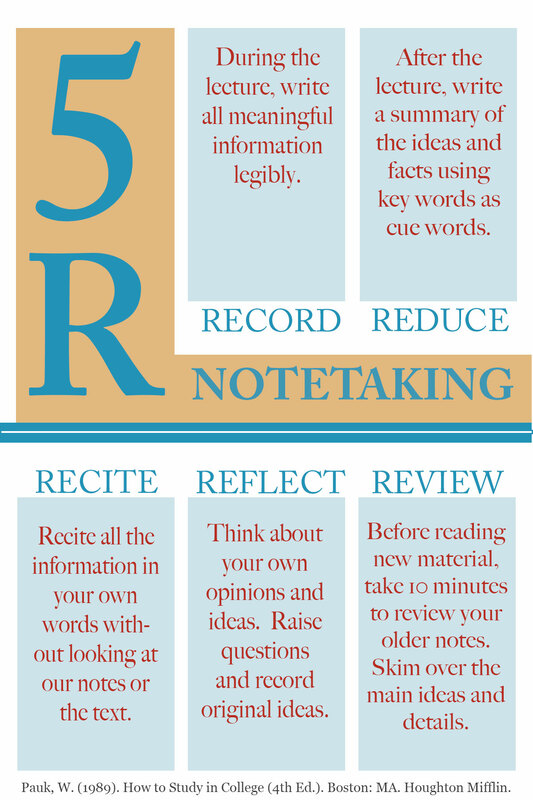
The before image does not make effective use of white space. The sans serif typeface is not the best type for smooth and easy reading. The different sizes of the typeface, could have been made better with proper alignment. The left side of the image, in particular, distracts and disrupts the eye with its right alignment. The absence of color and any other design elements leaves the design flat and uninteresting. The after image uses color theory and a split complementary color palette to achieve an interesting and harmonious design. The rectangular grid pattern makes good use of white space and is effective in organizing the information presented. They typeface is Adobe Caslon, which Before & After Magazine calls the "most readable typeface."
| beforeafter4.psd | |
| File Size: | 7141 kb |
| File Type: | psd |
The background color of the before image does not highlight the image. The color is not complementary or analogous. The light text on the dark background feels abrupt. None of the text is centered and the right aligned text particularly disrupts the eye. The after image attempt to uses the same design elements with subtle but impactful modifications. The photo is cropped with the rule of thirds in mind. Having the focal point of the photograph off-center helps add interest and is pleasing to the eye. Adding a small white border around it also adds interest. The other colors in the design were chosen to complement the photo. The dark blue font against the light background provide a nice contrast. The alignment is corrected so the eye scans more easily across the image. The bold typeface helps to organize the information and makes it easy to interpret.


