|
|
| beforeafter1.psd |
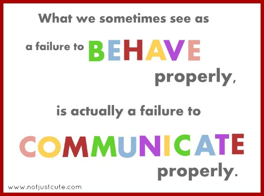
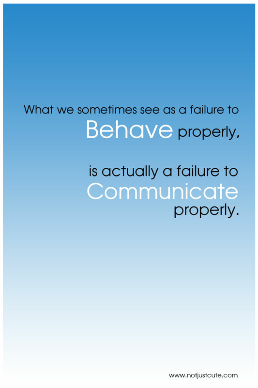
The white space in the first graphic in ineffectual. In contrast, the second image makes use of its white space with subtle gradient coloring. The change in case and the multiple font colors detract from the overall message in the first image. The second image maintains a consistent font style. The contrasting light and dark font as well as the change in font size achieves the emphasis on "behave" and "communicate" without distracting the viewer. In addition, the second image maintains consistent spacing and a right alignment which is more visually appealing than the first image's misalignment and haphazard spacing. A simple message needs only a simple design.
