
|
|
| beforeafter2.psd |
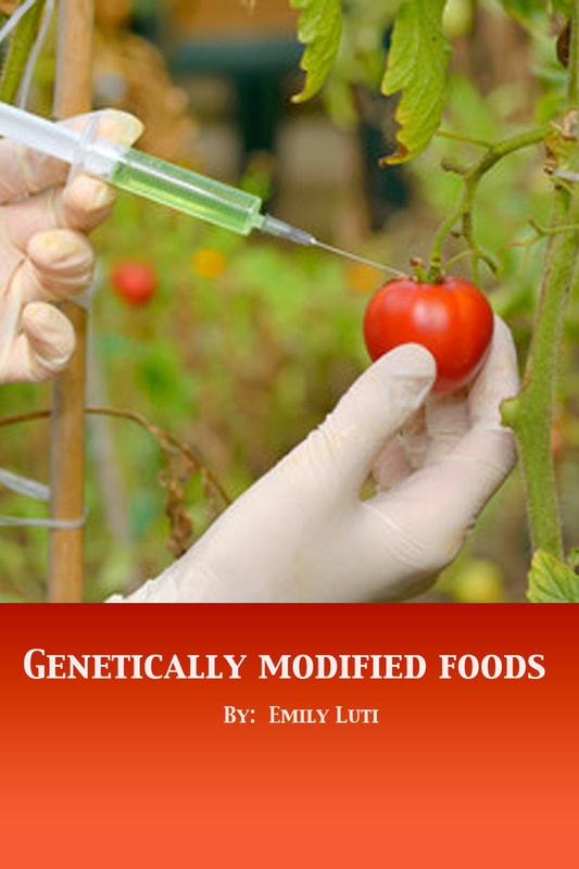
The first graphic attempts to highlight its main photo with a border, but the attempt fails to add interest to the design. The title is not positioned well and does not seem to have proper alignment. The font color is a poor choice, though proper positioning would have improved the design. The poor positioning limits the impact of the photo, the design's feature image. The second image follows the rule of thirds in photography and places the main object in the photo (the tomato) on the right side of the image to add interest. The title positioned at the bottom is also a nod to the rule of thirds. A stylized font is chosen that maintains simplicity. The background for the title is a red gradient that attempts to mimic the colors in the tomato, again adding interest but not detracting from or competing with the photo.
*The photo used in the second image is an Adobe Stock image.
*The photo used in the second image is an Adobe Stock image.
