|
|
| beforeafter3.psd |
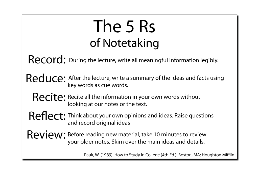
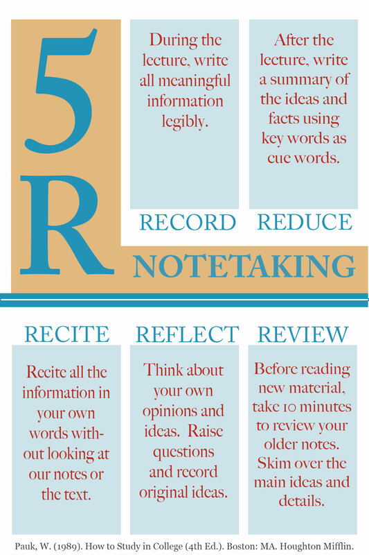
The before image does not make effective use of white space. The sans serif typeface is not the best type for smooth and easy reading. The different sizes of the typeface, could have been made better with proper alignment. The left side of the image, in particular, distracts and disrupts the eye with its right alignment. The absence of color and any other design elements leaves the design flat and uninteresting. The after image uses color theory and a split complementary color palette to achieve an interesting and harmonious design. The rectangular grid pattern makes good use of white space and is effective in organizing the information presented. They typeface is Adobe Caslon, which Before & After Magazine calls the "most readable typeface."
